Archive
Fixing Color Themes on Windows Phone
There’s a lesser-known feature of Windows Phone that allows customization of control colors without touching their Style or Template. This is accomplished by overriding special color resources defined by the OS. In fact there’s a whole page on MSDN dedicated to listing the color resources and how they’re used by various controls.
For example, adding this to App.xaml:
<SolidColorBrush x:Key="PhoneRadioCheckBoxBorderBrush" Color="Red"/>
<SolidColorBrush x:Key="PhoneRadioCheckBoxCheckBrush" Color="Blue"/>
</Application.Resources>
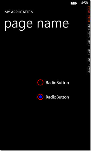
Produces this in the designer:
And in Windows Phone 7.0 that’s what you see at run time too. However, starting with Windows Phone 7.5 the colors DON’T display correctly at run time. At run time the color changes lost and the default OS colors are used instead.
This is a known issue and it’s discussed several places, but the article I like best is Windows Phone Mango Custom Application Theme Step-by-Step. I like the workarounds they provide too, especially Option1: Dynamically load all colors from a XAML file. With this approach, color resources are moved to an external file then loaded in at run time. The problem I have with their implementation is that it breaks the design experience since it does not allow these resources to be merged during design. So I set off to provide a simple solution that would work at both design time and at run time.
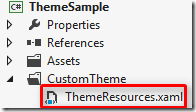
My solution starts in a similar way by adding a resource dictionary to the application that will contain the color theme:
I put mine in a subfolder but that’s just a matter of taste.
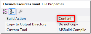
Next, we change the Build Action of this file to ‘Content’ instead of ‘Page’ (more on that in a moment).
Now we need to move all of our color resources out of App.xaml and into this resource dictionary. Here’s what mine looks like after the move:
xmlns="http://schemas.microsoft.com/winfx/2006/xaml/presentation"
xmlns:x="http://schemas.microsoft.com/winfx/2006/xaml"
xmlns:System="clr-namespace:System;assembly=mscorlib">
<SolidColorBrush x:Key="PhoneRadioCheckBoxBorderBrush" Color="Red"/>
<SolidColorBrush x:Key="PhoneRadioCheckBoxCheckBrush" Color="Blue"/>
<SolidColorBrush x:Key="PhoneRadioCheckBoxPressedBrush" Color="Green"/>
<SolidColorBrush x:Key="PhoneButtonBasePressedForegroundBrush" Color="Yellow"/>
</ResourceDictionary>
Finally – and this is one of the differences in my approach – we go back to App.xaml and merge this resource dictionary back in:
<Application.Resources>
<ResourceDictionary>
<ResourceDictionary.MergedDictionaries>
<ResourceDictionary Source="CustomTheme/ThemeResources.xaml"/>
</ResourceDictionary.MergedDictionaries>
<local:LocalizedStrings xmlns:local="clr-namespace:ThemeSample" x:Key="LocalizedStrings"/>
</ResourceDictionary>
</Application.Resources>
Now build the application and when you view the page in the Visual Studio (or Blend), you’ll see the color changes applied:
We’re not quite done yet though because the changes are still lost at run time. So what did we gain by moving the resources to a separate dictionary? We got the ability to update them quickly and easily at runtime using a little code.
In the sample code you’ll find a file called ResourceExtensions.cs. With this added to our project we can call one line of code and our colors are fixed at run time too. The method is called MergeColors and it’s an extension method added to the ResourceDictionary class itself. This method needs to be called inside the App() constructor. It should be called after InitializeComponent() but before InitializePhoneApplication(). Here’s a snippet:
/// Constructor for the Application object.
/// </summary>
public App()
{
// Global handler for uncaught exceptions.
UnhandledException += Application_UnhandledException;
// Standard XAML initialization
InitializeComponent();
// Merge custom colors
App.Current.Resources.MergeColors(new Uri("/CustomTheme/ThemeResources.xaml", UriKind.Relative));
// Phone-specific initialization
InitializePhoneApplication();
…
MergeColors first looks to see if the specified resource dictionary is already merged into the application (which it should be, since we merged it above so we can see our colors at design time). If the dictionary is merged it’s removed. Otherwise, it’s loaded into memory. Finally, each of the color resources is updated in the parent dictionary.
Now we have our custom colors at both design time and run time.
So, why did we change the Build Action above to ‘Content’ instead of ‘Page’? It’s because the Uri for a ‘Content’ dictionary is much closer to the Uri at run time. That makes it easier for MergeColors to see if the dictionary is merged at runtime and remove it.
That’s everything you need if you download the source. For completeness and for those who would rather copy and paste than download, here’s what’s inside the MergeColors extension method:
{
// Validate
if (dictionary == null) throw new ArgumentNullException("dictionary");
if (resourcesUri == null) throw new ArgumentNullException("resourcesUri");
// Check to see if the resources are currently merged
var resources = (from r in dictionary.MergedDictionaries
where resourcesUri.OriginalString.Contains(r.Source.OriginalString)
select r).FirstOrDefault();
// If resources are currently merged, remove them
if (resources != null)
{
dictionary.MergedDictionaries.Remove(resources);
}
// Otherwise, load them
else
{
resources = new ResourceDictionary { Source = resourcesUri };
}
// Loop through all color entries defined in the resource file
// If the same entry is found in the target dictionary, update its value
foreach (DictionaryEntry entry in resources)
{
// Try to get source and target values as color brushes
var colorBrush = entry.Value as SolidColorBrush;
var existingBrush = dictionary[entry.Key] as SolidColorBrush;
// If both were found, update
if (existingBrush != null && colorBrush != null)
{
existingBrush.Color = colorBrush.Color;
}
}
}
How Supported Rotations REALLY Work in Windows Store Apps
Apps can specify that they prefer portrait or prefer landscape in their appxmanifest by checking one or more boxes:
However, the app is not guaranteed to get the preferred orientation. The classic example is a game that requests portrait but is being run on a desktop machine with a monitor that cannot be rotated. The game will be forced to run in landscape instead and it’s up to the game to deal with this (e.g. letterboxing or putting content on the sides of the otherwise vertically laid out game).
At //build it was clearly stated that with 8.1 and the smaller 7” devices, most users prefer to hold the device in portrait. Of course in this scenario the device is portable and the OS knows that the device can be rotated, so if an app requests to run in landscape the OS would honor it. But be aware that it’s still possible for an app to get locked in portrait too. It’s less common but can happen. On my old desktop rig I ran dual 27” monitors where one was landscape and the other was portrait. On that machine if I ran store apps on the portrait monitor, the OS would force them to run in portrait.
In summary, you can ask for whatever orientation you want but be prepared not to get it.
For more information see the InitialRotationPreference element.
WP to W8: View States using Visual State Manager
| This article is part of a series about my experience porting apps from Windows Phone to Windows 8. Official porting guidance can be found here and don’t forget to follow the Building Windows 8 blog and the Windows 8 App Developer blog for the latest information.
If you are currently working on a Windows 8 app that you’d like reviewed for possible early entry into the marketplace, please contact me. |
In my last blog post I talked about using the Visual State Manager to deal with different screen resolutions and the new Snapped view. I thought it would be helpful to share an example of how to do it.
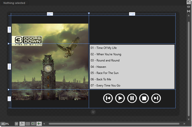
In the screenshot above we have a simple user interface for a music player. The left side shows album art and the right side shows the track list on top of the playback controls (Play, Pause, Stop, etc.). Notice that the screen is divided into three rows and two columns and notice that the rows are different heights. These will be important in a minute.
The playback buttons were created using the technique I described in my previous post. I copied AppBarButtonStyle and removed the label under the circle. Then I changed the Content property for each button to the character I needed for each “icon” (in Sego UI Symbol). Finally, the buttons were grouped into a horizontal StackPanel which allows me to organize and scale them as a group. Since the buttons are vector (font) based, I can make them extra large by selecting the containing StackPanel and setting it’s scale to 2.

With this layout we basically get ‘Filled’ view for free. The grid is a little more narrow so the track list isn’t as wide, and the album art shrinks just a little. But it still looks great so let’s focus on ‘Portrait’ mode next.
As I mentioned in the previous article, to properly work on View States in Blend right now you need to change both the Platform tab and the States tab. Let’s change to the ‘Portrait’ view (Platform tab) and to the ‘FullScreenPortrait’ state (States tab).
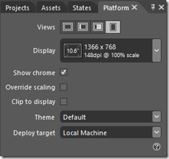
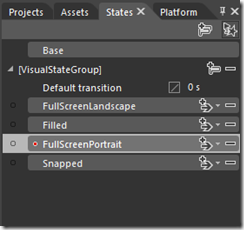
Now let’s make the changes for Portrait:
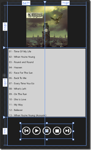
- Select the AlbumArt image and change RowSpan to 0 and ColumnSpan to 2. Now the Album Art is at the top and is centered on the screen.
- Select the TrackList and change Column to 0 and ColumnSpan to 2. Now the track list is also centered on the screen.
- Select the PlaybackControls panel and change its Column to 0 and ColumnSpan to 2. Like the track list, the playback controls are now centered on the screen.
Save your work. It should look something like this:
Now it’s time to work on Snapped view. Lucky for us it’s a lot like Portrait view. In fact, we’ll do exactly the same steps we did with Portrait but we’ll add one more step at the end.
Switch to ‘Snapped’ view (Platform tab) and ‘Snapped’ state (States tab).
Now the changes for Snapped (same as Portrait):
- Select the AlbumArt image and change RowSpan to 0 and ColumnSpan to 2. Now the Album Art is at the top and is centered on the screen.
- Select the TrackList and change Column to 0 and ColumnSpan to 2. Now the track list is also centered on the screen.
- Select the PlaybackControls panel and change its Column to 0 and ColumnSpan to 2. Like the track list, the playback controls are now centered on the screen.
The album art scales nicely. The text looks larger because the list isn’t as wide. We might want to decrease the font size but I think it actually looks good so I left mine. The biggest offenders are the playback controls. They’re way too big for the space.
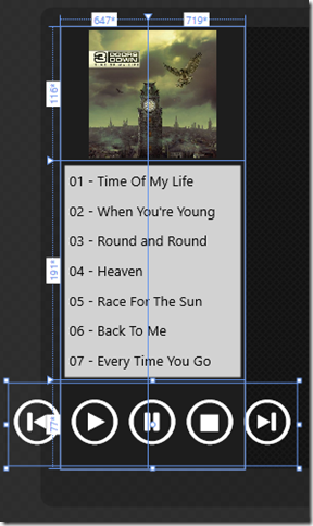
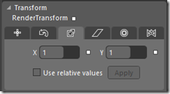
The cool thing about our buttons is that since they’re vector, we can scale them back down just the same way we scaled them up. Select the PlaybackControls stack panel and scale it back down to 1x.
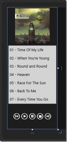
Now we have a cool little snapped view for our music player.
Run the application and test it in portrait, landscape, filled and snapped views. Because the page inherits from LayoutAwarePage, the correct Visual State is loaded on each change and our UI works great. You can play around with changing other properties and you can even test more complex layouts by adding additional controls and showing and hiding them based on the view state. Pretty cool!
The sample project includes both a ‘Starting’ point and a completed version. Note that the app isn’t a functional music player, it’s just a sample layout to help you get familiar with the Visual State Manager.
WP to W8: User Interface
| This article is part of a series about my experience porting apps from Windows Phone to Windows 8. Official porting guidance can be found here and don’t forget to follow the Building Windows 8 blog and the Windows 8 App Developer blog for the latest information.
If you are currently working on a Windows 8 app that you’d like reviewed for possible early entry into the marketplace, please contact me. |
In this article I want to expand on the information already available about porting user interfaces from Windows Phone to Windows 8. The most important place to start is an article titled Porting Silverlight or WPF XAML/code to a Metro style app on MSDN. It covers slight changes in the Application object, Window object and Navigation system. It also covers more involved changes to the Resource model and to Touch. I’ll talk briefly about touch at the end of this post and I’m dedicating an entire article to resources (hyperlink here when it’s done). If you haven’t done so yet, consider switching over to the official guide and coming back here when you’re done.
Metro
One of the biggest adaptations developers needed to make coming from any other platform to Windows Phone was learning to use the Metro design language in an effective way. If you’ve already built a successful Windows Phone app, chances are you’ve already made this change. Still, there are new and unique guidelines for Windows 8 apps that you need to become familiar with. In fact there are guidelines for things you might not have thought about having guidelines for, like drag and drop and edge-based animations.
These guidelines exist to make the Windows 8 experience consistent from application to application, which is important because consistency builds confidence for users. Luckily a good chunk of the work is already done for you simply by leveraging the built-in controls. Even if you’re creating highly customized content or your own controls, WinRT makes it easy to fit in by providing standardized animations and transitions right out of the box.
To learn more about the standardized animations and transitions see Quickstart: Animating your UI. For tons of great Metro guidance see Making great Metro style apps, UX guidelines for Metro style apps and design.windows.com.
Controls
Windows 8 of course has all the basic controls you’re used to like Button, CheckBox, ListBox, etc. As you may have heard, though, the namespaces are a little different. For the most part, simply changing references from System.Windows to Windows.UI.Xaml will get most of the basic tags working. But since we’re on the topic of namespaces, it’s important to note that the namespace syntax itself has changed.
Here’s the old syntax:
xmlns:myns="clr-namespace:xxx.yyy/assembly=zzz”
And here’s the new one:
xmlns:myns="using:xxx.yyy"
Not only is the new syntax simpler, but it leaves all of the assembly management to the underlying framework. This change does impact how you create things like strings though, so I highly recommend you read Porting Silverlight or WPF XAML/code to a Metro style app for more details.
You might be surprised to learn that Windows 8 does not include the Panorama or Pivot controls from Windows Phone. Keep in mind those controls were created to deal with small screen real estate, which isn’t much of a problem on Slates and desktop monitors. It’s vitally important to make good use of all the screen real estate available and the new SemanticZoom FlipView and GridView controls can help you accomplish this. Though FlipView could potentially be used to create sliding panels similar to a Panorama, don’t get caught up in trying to port your phone experience as-is. Instead, spend plenty of time playing with Windows 8 applications and understand the new controls. A GridView combined with SemanticZoom can offer a better experience on a larger screen than a Panorama would.
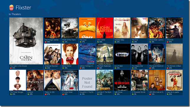
In my opinion, one of the most aesthetically pleasing apps in Marketplace right now is Flixster. Not all of the features from Windows Phone made it into the current demo, and it doesn’t currently use SemanticZoom, but I think it shows a good migration from Panorama to the new Windows 8 style.
After you’ve played around with Windows 8 for a while, check out Quickstart: adding ListView and GridView controls and Quickstart: adding SemanticZoom controls.
M-V-VM, Data and Portability
“Oh no!” you say, “Now that there are new controls all of my UI code has to change!” Not true if you’ve been following the popular M-V-VM pattern. M-V-VM allows you to separate the underlying business logic from what’s displayed on the screen. With M-V-VM there’s a ViewModel that provides data and commands that the View can bind to. If you’ve already done the work to put M-V-VM in place, your XAML will change but the underlying ViewModel may not have to change at all.
There are other interesting tricks you can employ to share code with Windows Phone. For example, Visual Studio 11 has the new Portable Library project which allows you to create DLLs that can be referenced and used in both projects.
If you haven’t been using M-V-VM or if you’d like to learn more about these techniques, be sure to read Improving Maintainability. To learn more about data binding in Windows 8 (including Grouping for GridView and SemanticZoom) see the article Data binding with XAML and the XAML data binding sample.
| NOTE: There’s currently a bug in Consumer Preview with data binding to ObservableCollection<T>. The XAML data binding sample provides a workaround. |
AppBar
The Windows 8 AppBar feels similar to the Windows Phone Application Bar, but there have been several improvements. One of the improvements I’m quite happy to see is support for data binding. I mentioned commands as part of the M-V-VM pattern above. In the current Windows Phone SDK there’s no way to bind AppBar buttons to M-V-VM commands, but in Windows 8 you can.
Windows 8 will run on a wide range of devices so user interfaces need to scale. Because of this need to scale, vector graphics are preferred for iconography over bitmap images. (WinRT has mechanisms for scaling bitmaps beautifully too, which I’ll talk about below.) With scalability in mind, the Windows team did something I think is very cool: they embedded the most common AppBar icons in a font called Sego UI Symbol. Font scaling works very well for this purpose, and if you drop an AppBarButton onto the art board and change its Scale (Transform panel) you’ll see what I mean.
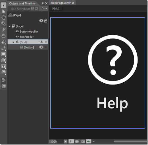
Unfortunately there isn’t currently an easy way to choose icons from the font using Blend or Visual Studio, but there are a few tricks. First, you can run Character Map and select Sego UI Symbol. Once selected, scroll down to the bottom and you’ll see the icons.

Click the ‘icon’ you want, click Select and then Copy. The ‘icon’ is then placed on the clipboard, ready to be pasted it into any button (or text block) that’s using Sego UI Symbol.
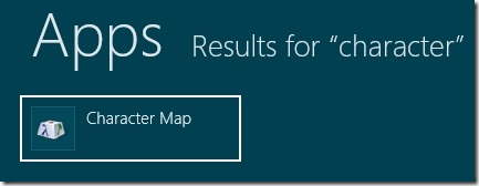
| Tip: To run the Character Map tool, from the start experience just start typing the word “character”. The start experience will automatically switch to ‘All Applications’ mode and begin filtering the list on what you type. |
Now to make things a little easier on developers, Visual Studio includes a file in every project called StandardStyles.xaml. This file has within it a number of predefined button styles that are setup to use these icons. Blend allows you to drag these styles out from the asset panel to automatically create a button with the style already applied. So, for example, if we wanted to create a help button we could drag out the following:
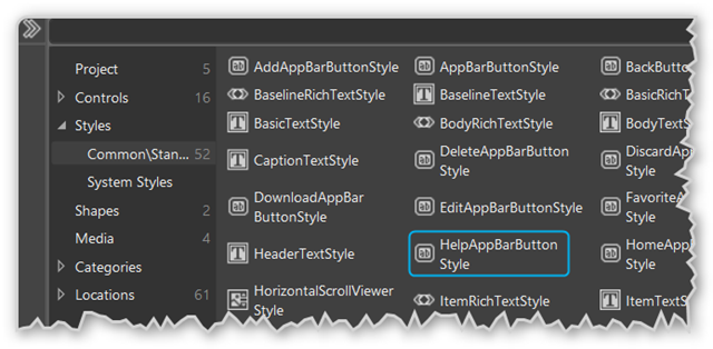
It turns out that Sego UI Symbol includes around 150 icons, but StandardStyles.xaml currently shipping with Visual Studio only includes styles for 29. You can either edit the style and use the Character Map trick above, or you can download an Updated StandardStyles from Tim Heuer. His awesome blog post XAML AppBar Button Styles for Windows 8 covers this topic and using these styles in even more depth.
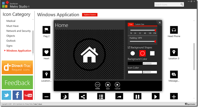
150 icons is great, but what if you don’t find the icon you’re looking for? Don’t worry because there are several other really great options remaining. One of my favorites is the awesome Metro Studio package by Syncfusion.
This package includes over 600 Metro style icons and gives you unprecedented control over their presentation. You can change the background type (none, square, outlined circle, filled circle), the padding, the background color, icon color and even the size. You can export the customized icon as .png, but even better you can copy the customized icon as a scalable XAML ready to be pasted into your applications resource dictionary. How much does this incredibly cool package cost? $0.00. Yup, free. Just drop ‘em a note to say thanks on Twitter, Facebook or Google+.
Okay, so that’s 750+ icons. But what if you still can’t find what you’re looking for? Well, there are plenty of other icon packs (just search for Metro Icons) and you can always create exactly what you need using Expression Design, Adobe Illustrator or my new favorite InkScape.
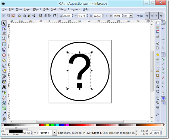
InkScape is free, open source, and can save as scalable XAML natively.
Scaling
Windows 8 supports a wide range of devices with varying resolutions and DPIs (dots per inch). This is different from Windows Phone which today supports only one resolution. Those who have written apps for Android might know what a challenge this can be, but fear not! Once again WinRT does most of the heavy lifting for you.
First, Windows 8 supports ViewBox, just like Windows Phone, which is great for games and fixed-layout interfaces. On the other hand, GridView and Grid are great tools for creating flexible layouts. Something you might not expect is that even in flow layouts, Windows automatically increases the scale of some UI elements as the DPI goes up. This automatic scaling makes sure that items like buttons and sliders are just as easy to grab with your finger at 260 DPI as they are at 130. This scaling, however, does not happen continuously across the full range of DPIs. Scaling only happens at certain thresholds. This is because apps still use bitmap images and bitmaps don’t tend to look great when they’re scaled to arbitrary sizes.
![]()
from the Building Windows 8 blog post Scaling to different screens
The scaling thresholds are set at 140% and 180% of the baseline resolution 1366 x 768. When these thresholds are reached, vector graphics inside ‘auto-scale’ elements are automatically scaled too. But what about bitmap images? Well, the WinRT resource system is smart and it will look for higher resolution images (based on a naming convention) to be automatically swapped in when the scale changes. The key takeaway, for me at least, is to design at 1366 x 768 and use the Platform tab in Blend and the Simulator to test designs at all resolutions and DPIs. At the very high end of the scale, it’s probably also prudent to consider modifying layout or swapping in different Data Templates to make the best use of the space.
More than anything I highly recommend the excellent article Scaling to different screens on the Building Windows 8 blog. It covers everything I covered here in far greater detail and it gives an inside peek at the factors that lead to this design. I really did find it fascinating. Guidelines for scaling to pixel density and Guidelines for scaling to screens are two other excellent references that cover naming conventions, fixed and flex layouts as well as general “Do’s” and “Don’ts”.
View States
Windows Phone developers are used to having the entire screen available for their app. Even system dialogs like phone calls and toasts appear on top of the application and don’t change available real estate. A Windows Phone developer today can design a user interface at 480 x 800 and expect it will work across all Windows Phones (though Microsoft has always reserved the right to add additional resolutions at some point).
In addition to supporting a much broader range of screen sizes and resolutions, Windows 8 applications are also required to support two new view states: “Snapped” and “Filled”.
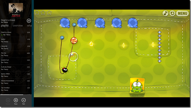
In the screenshot above, Cut the Rope is running “Filled” and Music is running “Snapped”. These two new states are what allow two normally full-screen applications to run side-by-side and share the screen.
I mentioned in the Scaling section that ViewBox and Grid are your best friends for dealing with multiple resolutions. The same is also true when it comes to Filled and Snapped. Cut the Rope was actually written in JavaScript, but the screenshot above shows what would happen if a ViewBox was designed to be “Full” at 1366 x 768 and then put into “Filled” mode at 1024 x 768. Notice the letterboxing (black bars on top and bottom)? Letterboxing is preferable to stretching and is acceptable for games and videos. Apps that use flexible layout (Grid, GridView, etc.) will automatically adapt to fill this space.
It’s very important to point out here that the Music app looks quite different in Snapped mode then it does in full screen. The rows of album art and the large track bar have been replaced with a small and concise listing of tracks. This fairly radical change allows the Music app to remain highly useful even with small amount of space it has. It’s no surprise that users will expect this type of behavior from your apps too.
If all this sounds daunting, you’re not alone. When I first read about the Filled and Snapped states my head was filled with visions of user controls, Xaml hacking and showing and hiding things in code. Thankfully, I couldn’t have been further from the truth.
Many Windows Phone apps today support landscape since we basically get it for free. Some of the more advanced apps are even using the Visual State Manager to switch to a customized layout that looks better in landscape mode. This same trick can be used for “Snapped” and “Filled”, and the Visual Studio templates help you do exactly that out of the box.
| Note: An introduction to the Visual State Manager is outside the scope of this article, but if you’ve never used or seen it before I recommend you check out the article and accompanying video Creating Control Skins with Visual State Manager on Christian Schormans blog. |
Whenever you create a new project, Visual Studio automatically adds a file under the Common folder called LayoutAwarePage.cs. LayoutAwarePage inherits from Page and adds four new visual states to itself:
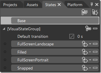
As you can see, the visual states correspond to the four possible view states that your app can be in at any given time. Using the Visual State Manager you can show, hide or change virtually any property of any element on the art board and those changes will only be applied when your app is running in that state.
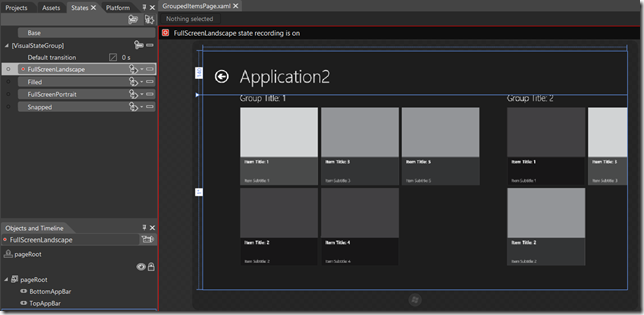
For example, let’s take a look at GroupedItemsPage (part of the ‘Grid Application’ template included with Visual Studio). Here GroupedItemsPage is in the FullScreenLandscape state (click for larger view):
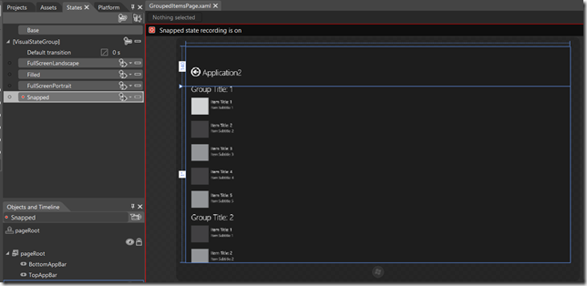
And here it is in Snapped state:
This works because the page actually has both a GridView and a ListView on it at all times. When the Visual State changes, one control is hidden and the other is shown (accomplished by changing the Visibility property).
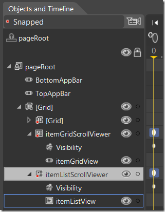
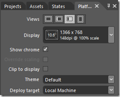
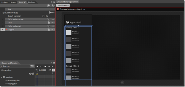
I’d like to pause and point out that in the ‘Snapped’ screenshot above, the app still looks like its filling the whole screen. That’s because the Visual State Manager and the Platform tab aren’t currently wired together in Blend. In other words, telling Blend that you want to see what the page will look like when viewed Snapped on a 10” slate doesn’t automatically trigger the Visual State Manager to switch to the Snapped state. (Remember, this is automatic switching is handled at runtime by LayoutAwarePage which Blend knows nothing about). So, to properly preview your designs in Blend you should set the correct View on the Platform tab:

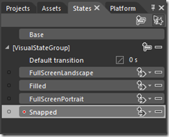
and set the corresponding State on the States tab. When they’re both in sync, the art board should show what you’d expect to see at runtime on that device (assuming you’ve got design-time data).
I dedicated the second post in this series to a step-by-step example of using this technique. See View States using Visual State Manager. And for more info see Designing flexible layouts and Guidelines for snapped and fill views. These pages provide additional guidance on scaling your interface to fit and be useful in Snapped view.
Keyboard
The on-screen keyboard is an integral part of Windows 8 and there’s little doubt that external key devices (i.e. remote controls) will continue to grow in popularity as well. With that in mind, all Windows 8 key events return a VirtualKey enumeration rather than a literal keyboard scan code.
If your Windows Phone app somehow uses scan codes, either update it to use the new enumeration (best) or check the KeyEventArgs.KeyStatus.ScanCode property to see if the virtual key has a mapping to the original scan code.
For more information see Plan for accessibility.
Touch
Windows 8 is designed to be “touch first”, but it’s also designed to work exceptionally well with a mouse and stylus. To make supporting all three pointing ‘devices’ as easy as possible for developers, mouse-specific events were replaced with new unified Pointer events like PointerEntered and PointerPressed.
Something else I found really interesting is that individual pointer events can be enabled and disabled per-element. On Windows Phone you can “hide” any element from all touch events by setting IsHitTestVisible=false. On Windows 8 you can hide it from specific events by setting properties like IsRightTapEnabled.
For more information see Responding to user interaction.
Well, that’s it for the User Interface article (whew!) Be sure to bookmark the series and check back soon for more articles on porting Windows Phone apps to Windows 8!
Courting Pinterest on WP7
The amazing Sara Summers (@ssummers) asked Pinterest on a date with an adorable and witty little online love letter. I love it! Who else wants to see Pinterest on Windows Phone? I know I sure would.
Advanced Windows Phone 7 Design Tips and Tricks
I’m doing my first delivery of the Advanced WP7 Design Tips and Tricks tonight for the D2Sig user group. If you came to hear me talk, thank you! You can download the deck and the samples from my SkyDrive here.
Awesome SketchFlow Book Available

Over this past last year I’ve had so many great discussions on SketchFlow, and what an amazing tool it can be for rapidly prototyping and developing ideas. Very recently a co-worker and friend of mine, Sara Summers, completed her book Dynamic Prototyping with SketchFlow in Expression Blend. Sara is a User Experience Evangelists and she is incredibly well versed in the tool. If you’re interested, you can grab the book here on Amazon.
Go Sara!!! ( Now get some sleep. 🙂 )
Clean Prototyping with Compositions
By now you’ve hopefully seen SketchFlow and how it can help you conceptualize your projects before turning them into reality. If not, I highly recommend you check out the Mix ‘09 session Sketch Flow: From Concept to Production.
One of the tasks common to prototyping and actual development is planning navigation between pages (or screens). Luckily, Blend make this as easy as right-clicking on any button and choosing Navigate To – <Screen Name>. When you do this, Blend builds links into the application flow so that the SketchFlow player and the live application understand how the user can get around. These links show up in blue and look something like this:
You’ll notice in the image above that both the Start page and Winary page can get to any other page in the application. That’s because both the Start page and the Winery page have a set of buttons that look like this:
In fact it’s very common to want some piece of navigation shared across all the pages in an application. For example a navigation bar on the left side of a page or across the top is very common on websites and in SharePoint. In Blend 3 we can support the same concept by converting a group of controls into a ‘Composition Screen’. That composition can then be shared across all pages, and the navigation it provides comes along as well. In the application flow, it ends up looking something like this:
But you might notice that things have become a bit messy and we have blue lines and green lines that seem to go to the same places. That’s because Blend is showing the new composition lines in green and the old manually defined navigation links still remain in blue. Luckily, with the composition in place the manual links are extraneous and can be removed. This is done by right-clicking the line and choosing Remove Connection. The Sketchflow player and navigation system are smart enough to realize the composition still provides navigation routes, even if the manual links are gone. So the player still works just like it did before:
With the extra links removed, here’s one possible cleaned up flow for this application:
Of course it doesn’t hurt to leave the original links defined, and it may even be desirable to have them there to clarify intent. For example, just because the user can navigate directly from login to an empty shopping cart doesn’t necessarily mean we expect them to do it often.
Finally, I’ll close with a cool new feature I noticed in one of the latest builds: It’s now possible to dim out navigation lines and / or composition lines for the screens you’re not currently viewing. Pretty cool.
The Role of Sketching in Software Development
It only been since 2006 that we seriously started to drive WPF adoption, and Silverlight 2 hit the web just a scant 11 months ago. Still, in such short time ISVs have created some amazing things with these platforms.
Unfortunately, though the platforms themselves have seen some serious adoption, inclusion of design in the software development lifecycle still has a long way to go.
The good news is that methodologies and best practices are starting to emerge and I look forward to some great articles on the subject over the coming months. I’ve personally had the opportunity to present on this topic with one of our User Experience Evangelists, Sara Summers, and we cover something every ISV can add to their methodology: Sketching.
Sketching isn’t hard and anyone can do it (though I’ll freely admit I was uneasy at first drawing my little stick figures next to what felt like Sara’s “creative art”). But the point of a sketch isn’t how well it’s drawn; it’s how well the sketch captures a moment or an experience for a user in an application.
Sketches are informal. They’re lightweight, and they can be thrown away. Sketches can be used throughout the development process and, when used correctly, can significantly reduce the need to revisit code that’s already complete. People need to see and ‘feel’ an application before they can accept its design, but unfortunately it’s costly and time consuming to build interactive user interfaces that will just be thrown away. That’s why we so often end up with ‘bugs’ or feature requests involving design after an iteration goes to QA.
Sketches help people see the vision of an application and interactive sketches help the user ‘feel’ how it will work. These alone solve many of the problems that exist in application design today, but there’s still the costly issue of building interactive UI that can’t be reused. Luckily, with Expression Blend 3, tools are on the way to help with reuse.
On her blog Sara talks about Why Static Wireframing is Dead or, to put it another way, why static sketches shouldn’t be “good enough”. She also does a great job introducing SketchFlow with Non-Destructive Iterative Design and Fast and Easy Interactivity. Finally, if you haven’t yet seen SketchFlow in action, the Mix ’09 session SketchFlow: From Concept to Production is definitely worth a watch.
Silverlight and WPF Controls
WPF and Silverlight have been out for a while now, and the number of controls available for these platforms is surprising. Consider this rather comprehensive list of Silverlight controls by Tim Heuer with at least 17 vendors and over 160 controls. Or this list of around 30 tools and libraries for WPF.
If you need to quickly check out and try out many of the available controls, Mike Taulty’s Control Browser is here to help. It shows all the built-in controls for both platforms as well as the controls included in the toolkit and many of the 3rd-party libraries available. It’s a great little click-once app, so head over to Mike’s Blog to read about it or click here to install.





You must be logged in to post a comment.